Re-skinning A Store Without Forking Core

There are four ways to change how the storefront looks, and they are not equal. Each step down this ladder gives you more control and costs you more on every upgrade.
Start at step 1 and stop as soon as the design is achieved. A theme built entirely on steps 1 and 2 survives a major EverShop upgrade untouched. A theme that forks twenty components does not — as the React 17 → 19 upgrade demonstrated, forked components keep their old assumptions and break silently.
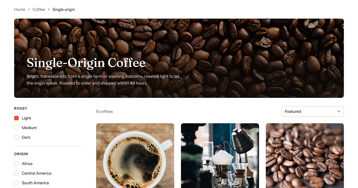
Everything visible above — type scale, colors, card layout, grid columns — is reachable from steps 1 and 2. Reach for step 4 only when the structure has to change.
| Step | Technique | Upgrade cost | Use when |
|---|---|---|---|
| 1 | Design tokens | None | Color, radius, spacing, type scale |
| 2 | CSS against core class hooks | Near zero | Layout tweaks, decoration, spacing on specific blocks |
| 3 | Additive components in existing Areas | Low | Adding something core does not render |
| 4 | Component override | High — you own it forever | The markup or behavior itself must change |
Step 1 — Design tokens
Most re-skins are entirely a token exercise. Core's components are built on CSS custom properties, so redefining them in your theme's tailwind.css restyles every component at once, including ones added in future releases.
:root {
  --primary: oklch(0.55 0.18 264);
  --primary-foreground: oklch(0.98 0 0);
  --radius: 0.75rem;
}
See Styling for the full token set and the Tailwind v4 setup.
If your theme replaces TailwindCss.tsx and ships its own tailwind.css, it must carry over the class-based @custom-variant dark (&:is(.dark *)) line. Without it every dark: utility inside the shared ui/* primitives activates from the OS setting while your .dark tokens stay inactive — half-dark components on a light page.
Step 2 — CSS against core class hooks
Core markup carries stable, semantic class names intended as styling targets. Writing CSS against them changes appearance without owning any component.
.category__hero { padding-block: 4rem; }
.product__grid { gap: 2.5rem; }
.product__filters { border-inline-end: 1px solid var(--divider); }
Verified hooks include header__middle__left, category__hero, product__grid, product__filters and variant-option-list. Inspect the rendered page to find others.
@layerTailwind v4 puts its utilities in @layer utilities. Unlayered author CSS wins against any layered rule regardless of specificity, so a plain rule beats core's utilities. Put the same rule inside a layer and it loses — which reads as "my CSS is being ignored".
Step 3 — Additive components in existing Areas
To add something core does not render, drop a component into an existing Area rather than forking the component that surrounds it. Your file is additive: core's component keeps receiving upgrades, and yours keeps rendering beside it.
// themes/my-theme/src/pages/productView/SizeGuideLink.tsx
export default function SizeGuideLink() {
  return <a href="/size-guide" className="text-sm underline">Size guide</a>;
}

export const layout = {
  areaId: 'productNameAfter',
  sortOrder: 10
};
Useful storefront Areas include productNameBefore, productNameAfter, productPageMiddleRight, beforeCategoryInfo and searchPageBottom. See View System for how Areas resolve and Templating for the full list.
Step 4 — Component override
Only when the markup or behavior itself must change. npm run theme:twizz ejects a core component and its relative-import closure into your theme, after which you own that file permanently — it stops receiving fixes, accessibility improvements and framework migrations.
Before overriding, check whether steps 1–3 get you there. If you must override:
- Re-read the component after every EverShop upgrade and diff it against the new core version.
- Preserve the accessibility contract — see Accessibility. Forks are exactly where
aria-describedbywiring and keyboard-reachable Add-to-Cart quietly disappear. - Preserve React 19 rules — see Upgrading To React 19. Module-scope
_()calls anddefaultPropsare the two that fail silently.
A worked decision
Say the design calls for product cards with a colored badge, tighter grid spacing and the price above the title.
- Badge color and card radius → step 1, tokens.
- Grid spacing → step 2,
.product__grid { gap: … }. - Adding the badge → step 3, a component in
productNameBefore. - Moving the price above the title → step 4. Reordering is a markup change, so this one genuinely needs an override — and it is the only part of the design that costs you on upgrades.
Three of the four requirements never touch a core component.
See also
- Styling — tokens, Tailwind v4, SCSS and global CSS
- Theme Overview — theme structure and the override seams
- View System — how Areas compose a page
- Accessibility — the contract an override must preserve
- Upgrading To React 19 — why forks break silently